Logo and Visual Identity for Fime
Logo a vizuální identita pro Fime
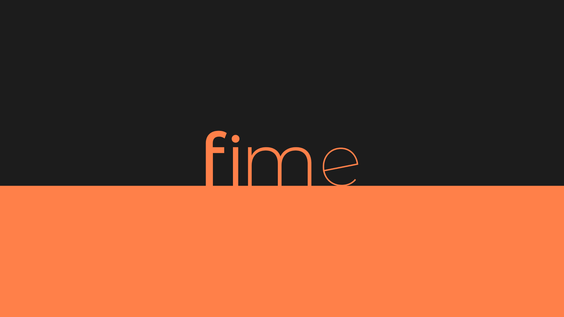
The logo of the company Fime consists of four letters, each rendered in a different weight of the same font. The logo starts with the bolder Medium weight, continues through Regular and Light, and ends with the thinnest Thin weight. This gradual progression symbolizes the same progress that users of the Fime app can achieve on their journey to a slimmer figure. The logo is always placed on a pedestal, which represents the company Fime as a support for its clients.
Logo společnosti Fime je tvořeno čtyřmi písmeny, přičemž každé je vykresleno jiným řezem stejného fontu. Logo začíná silnějším řezem Medium, pokračuje přes řezy Regular a Light a končí nejslabším Thin. Tento postupný progres symbolizuje stejný pokrok, který uživatelé aplikace Fime mohou dosáhnout na své cestě k hubenější postavě. Logo je vždy umístěno na piedestalu, který představuje společnost Fime jako oporu svým klientům.
Client: Fime
Art Director: Radek Moravec
Designer: Radek Moravec
Year: 2017